Making Items Move on Hover with CSS
I’m doing a little redesign of the site. I considered doing a big redesign locally and then a big push to the production site when I thought it was ready but that seemed like less fun then just adding little ideas along the way. It actually allows me to blog about some of the choices too which feels like a win.
WebDesignMuseum.org is a fun site that is exactly what it sounds like. It’s a look back at old sites and apps. In fact, I’ve written before that there is a noticable visual shift that matched the vibe shift with the internet in 2010s. The vibe shift feels permanent but the designs don’t have to be. I often say that websites 10-15 years ago simply had more personality. So my goal for the redesign is to make the site more personal, more fun to look at, and I don’t know…hopefully be a reminder that web design is an art.
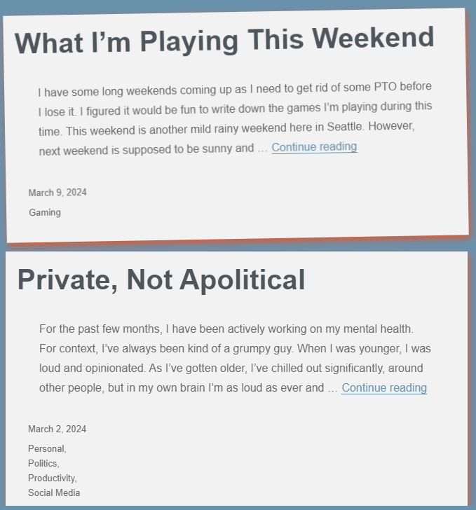
Ok let’s get to the thing the headline talked about. Apologies if you’re here from a Google search. On the main page of this site, when you hover over a post block, the block moves a tad. Here is how that works.

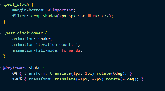
You don’t need any JavaScript for this. In CSS it’s just a couple of lines.

My post_block class is the class for…the post block. You need a class on the object you want to move. Why? To make the object move, you add a :hover pseudo class. In that pseudo class, you add an animation name (you will need this later. I called mine, “shake”), an animation-interation-count, and animation-fill-mode. The interation-count property is how many times your animation will happen. The animation-fill-mode was a new one for me. This property instructs what happens to the affect after it completes. Here is the MDN documentation for that. What I wanted was for the animation to hold the final value of the keyframe 100%. That’s what “forwards” does.
Lastly, we need to describe what we want the animation to do in the keyframes. This takes some experimentation. I was going for two things. 1. Make the animation snappy. 2. Make it subtle enough so it’s noticable doesn’t effect the readability. For point 1, I chose to have no values between 0 and 100. The affect is binary. It happens or it doesn’t. For point 2, this takes some experimentation but I was looking at values to make the box move, but quickly and subtley. Again, kicking back to the snapping point.
Now it works. If you got to the home page of this site you will see the effect in action. On mobile, hover effects don’t work quite the same way on desktop but it does do a little shift. It ends up being a singal you clicked on a post and it’s loading, which is behavior I think is cool too.
Hope that helps 🙂
Want to share this post on Bluesky? I made a button for that :).